01 — THE STARTING POINT
A new look for what's next.
Greenlight is a product from Charlottesville-based Shift Engineering that helps businesses put AI-built applications to work while giving IT teams the oversight and control they need.
As the team prepared to bring Greenlight to market, they needed a visual identity that felt like its own brand while still belonging to the Shift family.
We worked with them to develop a refreshed look and feel that was modern, approachable, and a little unexpected for the world of enterprise software.
02 — THE CALLS WE MADE
01
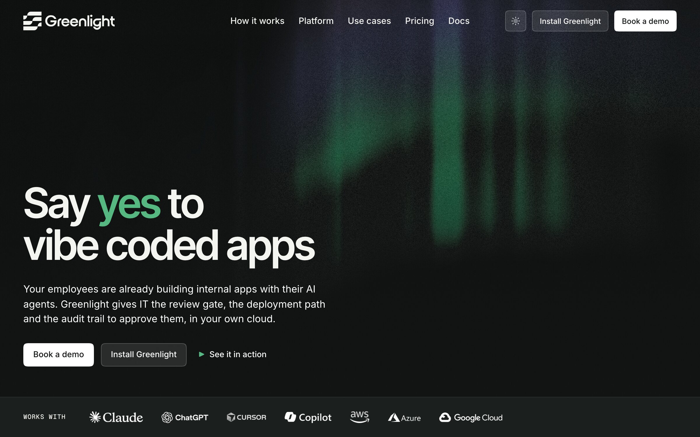
Inspired by the northern lights
We called the creative direction Aurora, inspired by the northern lights.
There's something interesting about the way the aurora moves. It's fluid and constantly changing, but there's a sense of calm to it, too. That balance felt like a natural fit for Greenlight.
The product is built around helping people move forward with new technology while keeping the important things under control. We liked the idea of creating an identity that could feel both energetic and grounded.
Rather than leaning into the usual visual language of enterprise software, we wanted something with a little more life.
 The event kit — banner stand
02
A familiar connection. A personality of its own
One of the important parts of the project was finding the right relationship between Greenlight and Shift.
We wanted Greenlight to feel connected to the company behind it, but not like a smaller version of the same brand.
Aurora gave us a direction to explore through color, typography, and the overall visual language. The goal was to create something distinctive without making it complicated, and flexible enough to feel at home wherever the brand shows up.
It's a balance we enjoy working through: giving a brand character while keeping the design simple and useful.
- Symbol
- 181 × 186 units · three bars of 39, slots of 15
- Lockup
- 912 × 186 · symbol at 1.7 × cap, on the cap band · gap of one bar
- Wordmark
- Surgena SemiBold · −0.03em · outlined once · cap height 109
- Colour
- One colour for both parts · Ink on paper, White on graphite
03
Two lights, each with a job
Every Greenlight screen has two characters in it: the AI agent that builds an app, and the platform that decides whether it's ready. We gave each one a color.
Green is the go-ahead. It appears when governance is in place and the answer is yes: the lamp, a passing check, an app that's live. Indigo belongs to the agent, marking a build in progress or a fix it wrote itself. When a row turns from indigo to green, an app has moved from the agent's hands into IT's.
Everything else stays quiet, so the two lights never compete and each one means exactly one thing. There's no red anywhere. When something's wrong, a simple cross and a plain word say so, and every pairing was checked so the system reads clearly on any background.
How much colour a screen gets
The marks
Measured · WCAG 2.2
- Ink on White
- 18.0:1
- AAA
- Verdant on Well
- 4.7:1
- AA
- Signal on Graphite
- 7.5:1
- AAA
- Indigo Deep on White
- 7.4:1
- AAA
04
Made to leave the screen
A brand doesn't live on a website alone. Greenlight needed to show up at conferences, on LinkedIn, and on the table at a stand, and it needed to look like the same brand in every one of those places.
So Aurora comes with an event kit: banners, covers, posts, and session cards for online, and business cards, a roll-up banner, and a table cloth for in person. Every piece draws on the same aurora, and the print pieces are ready to send to a printer as they are.
The business card says it simply. The aurora on one side, the name on the other, and the lockup in white, never green.
 The event kit — business card
03 — WHAT SHIPPED
Ready to meet the world.
The updated identity gives Greenlight a more cohesive and recognizable presence as it goes to market.
With Aurora as its foundation, the brand has a visual direction that can grow alongside the product while maintaining a clear connection to Shift.
For us, this project was a good reminder that even highly technical products can benefit from a little warmth, personality, and imagination.
04 — THEIRS TO BUILD ON
Greenlight now has a complete identity it can run with. The logo in every format it needs, a brand guide that explains how it all fits together, the aurora artwork, and the event kit with its print files, all handed over and all theirs.
Nothing is locked away with us. As the product grows, the team can keep building on Aurora without having to come back and ask, which is exactly how we think it should work.